Whoop Whoop! I have just been signed by the folks at the Central Illustration Agency, or CIA – an international resource for the very best in commercial art and motion graphics for the advertising, design and publishing industries and I’m chuffed to be among their roster of talents. Looking forward to seeing what this collaboration will bring!
European Data Visualisation Conference in Milan
I had the pleasure to visit Milan this month to speak at the European Data Visualisation Conference organised by Eurostat. I was honoured to be one of the keynote speakers along Professor Alberto Cairo and Semiologist Daniela Panosetti.
The event brought together experts from National Statistical Institutes from all over Europe and although being in the presence of such a technical and high profile audience was pretty intimidating at first, I enjoyed being an outsider and being able to share a different (hopefully refreshing!) perspective on data-driven storytelling.
Inconceivable
Proud of my contribution to Scientific American May issue – a timeless editorial feature on women’s reproductive health.
The magazine features a menstrual cycle infographic by Federica Fragapane with fascinating details as well as a detailed and moving article on the alarming rise in maternal mortality in the US. Thanks to Jen Christiansen and Amanda Montanez for getting me involved and kudos to Monica McLemore for sharing this heart wrenching, in-depth, and data-rich science writing. Best seen in print, check newsstands!
April 2019
Another award for Reimagine the Game
Fantastic news! Our campaign for Siemens ‘Reimagine the game’ won the award for best Technology & Telecommunications campaign at the World Media Awards 2109.
My first collaboration with Scientific American
Last month I worked on a fun visualization for Scientific American illustrating how (and how often) the magazine appears in the Oxford English Dictionary, by total number of quotations, first evidence for word, and first evidence for sense (a particular meaning).
Mark Fischetti wrote the text and the immensely talented Jennifer Christiansen took my visualization and beautifully edited to fit with the Scientific American style.
The visualization is now published. Grab a copy! 🙂
Project launch!
Excited to share ‘The Atlas of Digitalization’ – a data-driven interactive experience that illustrates digitalization across six cities. This another result of the partnership we have been building between Signal Noise and Siemens.
Data from 21 indicators has been analyzed from Buenos Aires, Dubai, Johannesburg, London, Los Angeles, and Taipei. From this analysis a Digital Readiness and Digital Potential Scores have been defined, revealing the current level of maturity of each city’s digital infrastructure, and its preparedness for a connected future.
We created six 3D eco-systems that represent key characteristics of each individual city across the areas of mobility, opportunity and sustainability. Visitors can interact with each city and explore its data, taking an in-depth look into how each is addressing its own challenges and opportunities.
The fourth issue of Market Cafe Magazine – a zine about data visualization – was launched this month and it’s another greatly curated editorial work.
This issue revolves around truthfulness in data, and the exhibition Data Obscura that we created last year at Signal Noise is featured along with a beautiful spread of our deconstruction of the Metoo Movement – Metoomentum.
The magazine is printed in two Pantone colours including a metallic ink. As usual, it’s a limited-edition with each copy being hand-numbered by Piero and Tiziana, so hurry up and grab a copy before it’s too late.
Twelve years on…
I had the pleasure to visit the LCC – University of the Arts London – at the beginning of the month to teach at the new MA in Data Visualization a fun (and messy) workshop on data and visual literacy.
And It was a privilege to return later this month, for an evening talk open to all students and be interviewed by SUPER-TUTOR Tony Pritchard about my journey in data design.
It was such a thrill to be back where it all began and I loved the stimulating conversation we had with students. We touched on many different points – from feeding my creativity with self-initiated work and the importance of collaboration, to some of the challenges faced in a non-diverse-enough industry and dealing with many pressures (especially in an Instagram world).
I hope the students got this message out of my interview: be kind to others and most importantly be kind to yourself!
February 2019
A brief update: a beautiful, but painful, holiday!
I visited France. I enjoyed the snow. I ate lots of cheese. I took a chair lift for the first time in my life. I attempted snowboarding. I thought I almost got it…when I fell and I broke my arm!
Building the data culture through an identity system
Over the past few months, at Signal Noise we have partnered with McKinsey and their branding agency Wolff Olins to update its identity system, culminating in the recent launch of a new global visual identity.
We were specifically commissioned to create a powerful and robust design system that enables McKinsey & Company’s consultants, editors, marketeers and partners to deliver insights visually, quickly and impactfully – revolutionising the way they communicate to clients.
Creating a design system that works for everyone in one of the world’s best consultancy firms was no mean feat – but after a discovery period in which we immerse ourselves to fully understand the current state of dataviz within the firm we were able to design a living, breathing, framework, capable of evolving with the needs of the firm. The design system gives designers the tools to be able to encourage change so that McKinsey & Company can communicate consistently in a recognisable way.
January 2019
New Adventure
Had a great time up in Nottingham attending the New Adventure Conference. An amazing lineup of speakers (I truly enjoyed every single talk) and a very warm community!
It was great fun to be sharing my experience and some thoughts around data design at the DXN fringe event! Thanks so much to everyone who came out to see my talk, and for the lovely folks that welcomed me to the city with a pub crawl!
2018
November 2018
Spoke at Information+ about mapping the world
October 2018
Sentinel – V2
I collaborated for the second consecutive year on ‘Sentinel‘ – a project byRichard Evans performed duringthe Manchester Science Festival. The performance is a multi-sensory journey through the present and future effects of global warming brought to life through projected dataviz, opera singing and electronic music. If you happen to be in Manchester on the 25th of October try to catch the show at the Waterside Theatre
Spoke at ND2C,Pakistan
Just returned from Islamabad where I attended my first truly international design event.
I had the honour of speaking at the National Digital Design Conference in front of more than 800 people. It’s been a phenomenal experience to share the stage with some exceptional designers and discover some local talent!
I never bounded so much with the other speakers and I will hold close to my heart the crazy laughs we shared. I also hope to find more reasons to visit Pakistan again, and for longer, the impression I had it’s been extremely positive. Thanks all for the warm welcome!
September 2018
A dandelion to give form to the shape of #MeToo
MeTooMentum is my latest self-initiated project – a visual analysis of the MeToo Movement.
The project was exhibited during Data Obscura in London in May. But it took me and my collaborator Lucia, a few evenings and weekends, to put the adapt the project for online usage.
And I’m super excited it’s finally ready to be shared. Not perfect, but hey it works on mobile too.
In this Medium article, I explain the process and ambitions behind the project. I’d love to hear what you think!
Outliers – our new meetup group
At the beginning of the year, I started a new networking group called Outliers in Data Design with a few other women. Our intention is to create a space for women and other under-represented voices working in the intersection of data and design to get together, to share experiences, ideas, and experiments with data.
Happy to report that after a couple of informal events run at the pub, we had our first official meet-up and it was a success – thanks all for coming along!
We have now set up a meet-up group so anyone can sign-up and keep an eye on future events!
It’s out!
The latest book by New Scientist, The Brain: a user’s guide was presented at NS Live the world’s largest Science festival hosted at the ExCel Centre.
August 2018
Booooom!! Excited to share ‘Reimagine the Game’!
At Signal Noise we have just launched ‘Reimagine the Game’, a project that has kept us busy for a few months, and the dev team has literally worked around the clock these last few days to process the data from the first game of the series.
The project is a totally unique platform allowing football fans to view FC Bayern games by listening to thousands of data points captured within key moments during the match.
Using incredibly precise audio detection technology, we created a 3D soundscape that maps the noise of the entire Allianz Arena and celebrate the partnership between Siemens and FC Bayern. We analysed the fan noise in combination with match data to identify interesting narratives and surface new perspectives on ‘fan energy’ and its interplay with on-pitch performance. From the fans calling out the team sheet to the game timeline, match highlights, most supported players and the social ripple of excitement, it’s through the voices of 75,000 fans that we can now judge and compare the quality of each game. By responding to every change of possession, questionable decision or missed chance, the fans give us the perfect lens through which Siemens reimagine the game.
July 2018
My first Glug
The lovely folks at Glug have invited Signal Noise to present our latest exhibition Data Obscura. I had fun presenting with Hem (one of the three founders of Signal Noise) and now you can see the recording of thetalk online
June 2018
¡Olé!¡Olé!
This June marks the 5th anniversary since we published The Infographic History of the World. And what best way to celebrate than receiving a copy on the new Spanish Edition. Thrilled to see that the book is still expanding its global footprint…thanks Desperta Ferro for making it possible!
May 2018
How can you use visual metaphor to evoke emotion?
Happy to be part of episode 14 of Data Viz Today. Host Alli Torban dives into specific ways to find a visual metaphor that’s right for your data and I had fun discussing with her some thoughts on how to use visual metaphor to create a beautiful, meaningful, and memorable data viz.
Data Obscura and the launch of MetooMentum
I’m very proud to be part of Data Obscura – an exhibition curated by Signal Noise.
Over the past few months, we have had some very stimulating discussions in the studio about the relationship between data and truth. How does our online interaction distort, refract, obscure or enhance what we hear, what we see and – ultimately – what we believe?
The exhibition is the outcome of many collaborations and the effort of many talented individuals that inspire me every day at work. In particular, I had the pleasure to collaborate with kick-ass developer Lucia Kocincova on a project that it’s very important to me: a visual deconstruction of the MeToo Movement – aka MetooMentum.
If you are in London, don’t miss the chance to see our projects at Protein Studios until the 10th of June!
April 2018
A masterclass during the D&AD Festival
Last year, I was proud to be among the judges of the D&AD New Blood Awards, and this year I was thrilled to be part of the festival with a 2-hour masterclass attended by forty people. Thanks to everyone for participating and for the stimulating conversations.
After the workshop, I also had the great pleasure to catch up with Ruth Hamilton who interviewed me on my process and advice on creating infographics. You can read the full interview on Creative Blog.
On show in Turin
After 12 years of living abroad, I finally had the opportunity to exhibit my work in my hometown with a solo exhibition dedicated to Oddityviz.
Wild Mazzini is the first art gallery focusing on representing artists working with data and I was so excited to be selected as their first exhibition. I’m very grateful for all the positive feedback, and the great press, but more than anything I’m so happy I was finally happy to show my family and close friends what I do for a living! If you happen to be in Turin the exhibition is on until the 8th of May.
Thanks Wild Mazzini for the awesome opportunity.
March 2018
A new collaboration
Since the beginning of the year, I have started a new project with the New Scientist. I have been commissioned the illustrations and art direction for a new book about the Brain.
I’m pretty excited about how it has been shaping up. An unusual brief (not much data involved, but lots of scientific information) but I’ve truly enjoyed learning about how our most complex organ works.
As a lover of anatomical art, vintage science illustration, I instantly delved myself into mid-century references like Fritz Kahn, who has become a huge inspiration for this work. In his 1926 classic Man as Industrial Palace described the human body as ‘the highest performance machine in the world’ and used industrial metaphors to illustrate its remarkable capacities.
The book will be out at the end of summer – I can’t wait to share more!
February 2018
Still thrilled to have been on that stage!
This month, I visited Munich and spoke at EDCH Conference – it was an impressive festival for editorial design, visual storytelling and digital content. With great people, inspiring lectures and wonderful moments. For example, LinYee Yuan, who has just founded the magazine Mold in New York, which deals with the future of food, or the powerful talk by photographer and artist Claudia Kent on portraying Gender and Sexuality.
I’m still overwhelmed by all the talks, chats and the fact that I had the opportunity to talk about the importance of communicating with data in front of an audience of five hundred people.
I’d like to say a big thank you to the organisers – especially Sven Ehmann – for having me, it’s been a wonderful experience!
January 2018
A new venture: Signal Noise, here I come!
It gives me great pleasure to announce that this new year has begun with a brand new collaboration. I’m excited to be joining the team at Signal Noise.
This data design agency has been at the forefront of data-driven products and information design. I’ve followed their growth closely throughout the years. And I recall first meeting the founders in 2012. Five years on, they’ve joined the Economist Group, expanded their London-based team and recently opened an office in New York City – pretty impressive!
While I’ll carry on running my own projects and workshops, I’m looking forward to connecting our visions and exploring together the future of information design, dataviz and user experience.
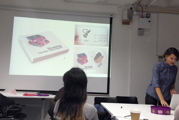
Oddityviz featured in Computer Arts
This month marks the second anniversary of David Bowie’s passing and one year since our tribute with data – OddityViz. I wrote an article for Computer Arts sharing insights into the process behind this self-initiated project, my motivations behind the work, and how I started to work in the field.
Excerpt below…
“My personal interest in data visualisation took off more than ten years ago, when working on my thesis for a postgraduate degree in visual communication. By exploring bias in gender cues that children receive through visual stereotypes, I started to collect and visualise data. Since then I have kept exploring the world collecting, deconstructing and mapping information. This curiosity and investigative approach lead me to publish a book – The Infographic History of the World – in which 100 infographics take the reader on a journey through human history.
Data can be found all around us. Simply put, data exist as a set of values. These can be observed in where we go, what we consume, touch, read, watch or hear. In fact, my latest self-initiated project explores the application of dataviz techniques to music – giving form to what we hear, imagine, feel while listening to a song. OddityViz is also a tribute to an extraordinary artist, exhibited in January 2017 to mark the first anniversary of David Bowie’s death.”
We all know that time flies when you’re having fun. Well, this year flew by and it’s definitely been a great one with a lot of adventures and exciting projects: working, teaching, speaking and playing. Thanks for being part of it!
So here is a summary of my 2017 in numbers: One – project acquired by a museum Two – the times I was asked to judge design awards (including the prestigious D&AD New Blood Awards!) Three – the exhibitions I took part in Four – holidays (that’s the way: work hard, play harder!) Six – the talks I gave Eight – the nights spent in the desert during my first incredible Burning Man Nine – the chapters in Sentinel, a project on climate change performed during the Manchester Science Festival Ten – the commercial projects completed including two long full-time contracts Eighteen – the workshops I run
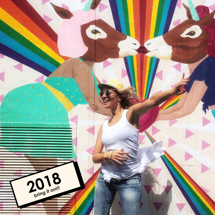
This counting is getting exponential – so time for some rest over the Christmas break and I will be back in full swing in the new year with some news. 2018, bring it on!
Music, dataviz, typography – what do they have in common?
Typographic 70 – a beautiful magazine published in the UK by the International Society of Typographic Designers – has just been released.
For this issue, I talk about music, dataviz and typography. There is an extract below.
I hope you enjoy the reading and if you wish to grab yourself a copy, head over to here
Music notations, dataviz, typography – these are all languages and as such they have commonalities. They convert information into a coded form that is designed to be universally read, to be decoded. These disciplines are interconnected. Think of music notation as a kind of visualisation; pitch height corresponds to vertical height on the stave, and the type of note describes the tempo. Traditionally, typography has been understood as ‘the work of setting and arranging type’, but broader understandings of the discipline encompass ‘the procedure of arranging type or processing data and printing from them’.
This piece of work sits at this intersection. Bowie’s alien language is visualised through a system that reveals patterns and insights. Similarly to music, the system is not something universally understood. However, as you learn how to read it, the language becomes meaningful and legible. We are hoping that the project will make the experience of listening to a song more ‘visible’. Giving form to what we hear, imagine and feel while listening to the song is at the core of OddityViz. In my opinion, dataviz is more than a tool to render numbers, it’s a way to make sense of any experience and communicate the stories that the data reveal.
November 2017
OddityViz won a Silver at the IIB Awards – Yay!
I am still buzzing from yesterday’s IIB Ceremony. You can tell from the picture… we were pretty excited!
I feel so honoured and proud to have won a Silver for OddityViz at the Information Is Beautiful Awards 2017. Ok, it’s not a Gold, but still a great achievement! Especially considering that among this year’s finalist entries there were some truly impressive projects. Sharing the stage with so many awesome people is my motivation to do even better, it’s really inspirational.
Huge thanks and hi-fives to everyone who has been supporting me and Miriam along the way!
Workshops, workshops and, you guessed it, more workshops!
In the past three months, I have delivered nine workshops while travelling from London to Vienna, Geneva to Amsterdam. It has been very demanding but the rewards have been more than worth it. Every section enriches me with new insights into what people think about dataviz and the experiences everybody shares. I am also becoming more and more obsessed with the beautiful maps everybody draws during one of the practical activities, where we learn the basics of a visual display of information by mapping personal stories. In the new year I should publish an online gallery, or perhaps create an online course on Skillshare – would you join? I’d like to hear your thoughts!
October 2017
Lifetime goal: my work in a museum?!
The time had finally come on 25th October 2017: the new Weltmuseum Wien opened its doors after three years of reconstruction – and we were there celebrating the grand reopening!
We were invited to an exclusive VIP party among the likes of the Austrian president, Wes Anderson, and Tilda Swinton. We had this exciting privilege because the museum has acquired my work Poppy Field – a visualization of the last century wars in the form of an interactive touch screen display, where visitors are invited to share messages of commemorations.
Having my work as part of a permanent collection is a dream come true and I could not be more honoured to be in the permanent collection of one of the world’s leading ethnographical museums which values are tolerance, respect, and cooperation.
Dataviz meets electronic music in an engaging live performance dedicated to climate change – aka Sentinel
For the past few weeks I have been working on the art direction and animating dataviz content for Sentinel – a live performance on climate change in sound & light. It has been incredible to see all our efforts coming to fruition this week in the Waterside Theatre during the Manchester Science Festival.
The project, conceived and performed by Richard Evans, with vocals by mezzo-soprano Olympia Hetherington, is a one-hour performance featuring my dataviz work to discuss issues around climate change, and get the audience closer to these important issues.
The show was followed by an in-depth panel discussion with climate scientist Dr Ed Hawkins, evolutionary biologist Professor David Robertson, and immunologist Dr Jo Pennock. The discussion was about the show’s compelling, challenging and thought-provoking themes.
September 2017
Poppy Field exhibited at EDIT
In Toronto’s Port Lands, the inaugural EDIT – a 10-day immersive festival full of world-changing ideas – brought together art from all over the world to discuss the UNDP’s Sustainable Development Goals. I am honoured that Poppy Field was selected by renowned Canadian designer Bruce Mau to be in the showcase of infographics that demonstrate both our achievements in social change and the challenges we must confront together – piece being one of our goal as a global civilisation.
I was thrilled to be sharing my work and some thoughts about information design and dataviz with a vibrant and warm audience. I specifically focused on what I believe to be at the core of what I do: rendering numbers to create experiences, and build an empathetic bridge with the audience.
Thanks everyone for coming to my talk on a late Monday evening!
July 2017
A swarm about Climate Change
Increase reach and accelerate action. These were two of the primary objectives we addressed in last week’s Swarm about Climate Action. I was thrilled to be invited to join more than 50 brilliant minds from different continents and different sectors – NGOs, scientists, designers, artists, activists – in the beautiful Norfolk countryside. At the West Lexham meetup, we convened to explore strategies for accelerating and scaling action for Mission2020 – a global initiative to bend the curve in carbon emissions, prior to the point of no return.
It’s difficult to summarise this 48-hour task: a challenging, thought-provoking immersion into the reality of climate change, the breadth of its implications, and the challenges of communicating a message with so many different audiences. The experience left me enriched in many ways, beyond global warming. Design is a powerful tool to enable and initiate change. This experience solidifies my belief that the creative community can, and should, play a bigger role in such a pivotal movement. I hope that the seeds planted in this Swarm will grow to fully-realised partnerships and collaborations for action. I look forward to the next inspiring steps!
June 2017
Heyyo Eyeo!
For the past seven years, the Eyeo Festival has brought together some of the most exciting work in the fields of information visualization, digital art, and interactive technology. This year, I finally made it to Minneapolis for my first Eyeo and I am happy to report that it was an amazing experience!
Selected as one of the opening Ignite talks, I was thrilled to share OddityViz with such a generous and warm audience. I was overwhelmed by the positive feedback and really happy about the connections I made. While diversity of the programme – art, urban planning, biology, dataviz – was great, what really blew me away was the vibe of the festival. Apart from offering inspiring talks, Eyeo assembles an incredible community of creatives, coders, researchers, designers and artists. The festival encouraged some reflection on my practice and inspired my thinking about future projects. I hope to be back at Eyeo soon, and look forward to more exchange with this inspiring community!
I was honored to be invited to judge the New Blood Awards – the student category of the prestigious D&AD awards. My fellow judges were a great bunch coming from diverse backgrounds all linked by a passion for making sense of data.
We consciously reviewed the many responses to a Nationwide brief which posed a challenging question: how can data-driven storytelling and open banking engage their audience with a subject they might have previously ignored?
It was an absolute pleasure (and an education) spending a day reviewing, pondering, and debating which projects to award. Thanks D&AD for inviting me and well done to all the students who submitted their excellent work! Keep an eye on the D&AD’s website to find out about the winning projects!
Did you know that David Bowie sang in Italian?
Yes indeed he did, and his accent…not half bad! Have a listen…
For La Lettura, the weekly supplement of the Italian newspaper Il Corriere della Sera, I created a new adaptation of Oddityviz. The visualization compares the original lyrics of Space Oddity and the Italian version Ragazzo Solo, Ragazza Sola written by Italian lyricist Mogol.
A constellation of emoji gives form to the semantics of the text in a universal language that breaks the boundaries of geography. The Italian vocal for Ragazzo Solo, Ragazza Sola (which translated means Lonely Boy, Lonely Girl) is not Space Oddity sung in Italian, it’s an entirely different song – the iconic dialogue between Ground Control and Major Tom becomes a love song in which stars, helmet and pills are replaced by broken hearts, love symbols and moons.
April 2017
Meeting the folks at the Financial Times
Anybody working in the field of dataviz is familiar with the great work the folks at FT are doing in the communication of statistics to a wide audience. Well, I finally had the pleasure to meet with the team responsible for creating this outstanding output. I have long been a follower of Alan Smith’s work (Data Visualization Editor at FT – I highly recommend to check his TED talk here) and it was great to have the opportunity to discuss with him and his team some ideas around why and how we visualise numbers, and how we can strengthen the fabric of these renders to create an empathetic bridge with our audience. The road is long and full of twists!
March 2017
Data Stories – my first podcast interview!
I can’t quite decide whether I was more excited about my first podcast or more embarrassed about listening to my own recorded voice. The great team behind Data Stories – Stefan Moritz and Enrico Bertini – interviewed Miriam and me about our OddityViz project. We had so much to say and not enough time, but I hope we covered some interesting thoughts about the project, our collaboration, our learnings and some of the difficulties we encountered. Thank you so much for listening, hope you’ll enjoy it!
I just returned from Italy, where I had a great time speaking at Visualized Milan.
Visualized is a data, storytelling and design-driven event which originated in NY. For its Italian edition, Base in the heart of Milan’s creative hub brought together more than 200 awesome people from the European data viz community. The line-up presented a nice mix of disciplines, covering a range of topics from the arts to politics – mixing students, academics, data journalists and designers.
I was thrilled to return to Visualized (I presented my book in 2013 in London) and share my journey in deconstructing and visualising Space Oddity – aka OddityViz. Distilling months of work and presenting ten visualizations in a 15-min talk, was not an easy task. But the positive feedback post-talk really paid off! I don’t know yet when and where the next event will be, but if you have the chance – go! Thank you Maral and Piero for inviting me!
A nice chat with the creators of Market Cafe – a new ‘zine about dataviz
I was recently interviewed with Miriam Quick about our OddityViz collaboration by the creators of a new dataviz magazine: Market Cafe. This beautiful small format duotone ‘zine is about people working in the data visualization industry. Tiziana Alocci and Piero Zagami look for different voices about what designing information means and where it’s going.
You can read the full interview here, but I highly recommend that you get your hands on one of the 500 copies before it sells out. The magazine is self-initiated, self-funded and distributed – well done Piero and Tiziana!
To close the OddityViz chapter, Wieden+Kennedy provided the best exhibition space I could have hoped for. Not only were we given full creative freedom and production support to create an installation on their window display on Brick Lane, but they also hosted an opening night that marked the first anniversary of Bowie’s death.
I won’t lie – getting everything ready came with last minute headaches and sleep deprivation but I am really proud of the final result and very happy about the overwhelming feedback. Thanks all for coming to the exhibition and for buying the artworks in support of music therapy!
A tribute to David Bowie called OddityViz
I consider data a raw material that allows me to explore topics through various lenses and to express how I feel, what resonates with me – hoping others will find it compelling too.
At the beginning of 2016, when David Bowie died, I decided that I wanted to create something to celebrate his work. I sought the expert knowledge of music and I started a collaboration with Miriam Quick – data journalist and phd in Music. This self-initiated project is aimed to visualise once of Bowie’s most iconinc songs Space Oddity in order to better understand how the song was created.
It’s been a journey. From learning about music, digging into the many layers of data, reading about Bowie, sharing ideas with Miriam, researching how to encode the information, and play with different materials and formats. I truly enjoyed the process and I hope you will enjoy reading about this journey into seeing music on the website that we have just launched!
2015
December 2015
’17 Global Goals for the United Nations
I was incredibly honoured to be invited by Glug to be one of the 17 artists to take part in a campaign aimed to raise awareness around the updated UN’s 17 Global Goals.
I was asked to reflect on the goal ‘Sustainable cities’. My final poster seeks to widen the lens on our approach to sustainable cities, referencing the timeless 1970s literary investigation of Italo Calvino – Invisible Cities – hence the ‘invisible’ art direction of the poster. The 17 posters were exhibited at the House of Vans as well as the UN convention. More about this project here.
In Beirut for Data4Change
It’s been an incredible experience to be one of the mentors at Data4Change in Beirut. Expertly organised, the workshop brought together a great mix of talents from all over the world to help visualise important and urgent data stories. The programme was constructive and inspiring, including thought-provoking activities and productive work sessions. It is my hope that the solutions offered to the human rights organisations will prove effective … and that the experience (and its impact) will endure with new collaborative relationships.
Book launch…And time to party!
The book has been out for a couple of weeks now, and it’s still a surprise every time I see it in a bookstore. A pretty big achievement, probably the most difficult but also the most satisfying project I have ever worked on. To celebrate the book launch, I will host an exhibition and event at the Kemistry Gallery in Shoreditch. Come and join us for a big celebration!
*Update 4th July: the night has been a great success, thanks for everybody who made it! Pictures of the event here
October 2015
The making of: Everything Harle Left Behind
I was recently commissioned by the National Trust in collaboration with Studio Weave two large-scale maps and a board game, as part of the first public exhibition at Rainham Hall. The hall has opened to the public following a major conservation and interpretation project about its first inhabitant – Captain John Harle (1688–1742). In this video, I am sharing the process and research involved in the creation of the artworks I designed and illustrated. Hope you’ll enjoy it!
Full project here
September 2015
In Belgium for a day – quick but sweet
Embracing the picture-worth-a-thousand-words perspective, people continue to use visual metaphors to share their ideas with others. Cypres invited me to talk about the power of visual storytelling in connecting with the audience during a corporate event at their offices. And the guys do know how to run an event, they even offer a complimentary copy of my book (Dutch version) to the participants. 90 books signed – made me realise I need to shorten my signature! 🙂
August 2015
Two years. Eight languages. Nine countries.
It’s hard to believe that it’s been two years since The Infographic History of the World has been published in the UK. And even more incredible is that our book’s now being sold in nine countries around the world, from North America to Japan.
Italian publishers out there, I am still hoping for an Italian edition! 😉
July 2015
The Art of Bureaucracy
Eliane Glaser with Pil and Galia Kollectiv brought together academics, writers and artists at the ICA to expose and represent the meaning and function of bureaucracy – the scourge of everyday life that we all contend with, yet rarely think or talk about. I partnered with my friend and colleague Tom Hartnell to investigate a bureaucratic artefact: receipts. Paper receipts will soon be a thing of the past, replaced by yet another digital substitute. We aimed to capture the aesthetic language of these curious artefacts and the stories associated with them before they go. We had a great day presenting our findings.
June 2015
Project launch – CITIE
Earlier this year I collaborated with Future Cities Catapult to design the interactive report CITIE – a partnership between Nesta, Accenture, and the Catapult. The project is a global benchmarking study designed to help city governments develop an actionable policy to support innovation and entrepreneurship to address some of these issues. The developers at Uniform have done a great job and I am excited to report that the website is live. It has been featured across the international press, including the Wall Street Journal, Wired and Business Insider.
May 2015
Let’s Data Rave!
Data Rave is an initiative that emerged during Visualised.io London in 2014 with the aim to bring talented data & design lovers from London closer together. I was delighted to be one of the two guest speakers at the first event, which was hosted by IIB Studio. Fun and inspirational night with some old and new faces.
Thanks for having me and my pain anatomy!
April 2015
In Utrecht with Graphic Hunters
I have just returned from the Netherlands, where I run a very enjoyable workshop to a mix audience about Infographic Storytelling. Thanks to all participants and to Graphic Hunters for organising the event.
And the good news is that I will be back, so if you could not attend this workshop I’ll be back in the Autumn for two more dates. You can reserve your place here or read my interview to find out more about the topics covered in the programme.
March 2015
Irish Design Year
I was delighted to be in Dublin to run an Infographic Workshop as part of the Irish Design year ID2015. I enjoyed discussing with a group of professional designers the role of infographics in conveying complex ideas in an easy to understand and visually compelling format.
Following the high demand for the workshop, I will be back during the summer for another one-day workshop. Keep an eye on the programme for updates.
February 2015
Ready for the next creative challenge.
I’ve had a lot of fun working with data-driven start-up Fathom for a good portion of 2014 – I met incredibly talented people and I got involved in some challenging but very satisfactory projects (most of which I cannot disclose unfortunately).
And I am now very excited to start a new collaboration with a very special place: Future Cities Catapult. Future Cities is all about urban innovation aiming to improve quality of city-life, strengthen economies and protect the environment.
January 2015
Judging the MJA 2015 Winter Awards
Late last year, the Medical Journalist Association invited me to judge the Data Journalism entries for the 2015 Winter Awards.
Entries have now closed and judging is underway. The winners will be announced at the presentation at BMA House on February 5. Good luck to everybody!
Update 6 Feb 2015: And the winner is…
Dawn Connelly from The Pharmaceutical Journal took the Data Journalism prize for a great infographic charting The Ebola virus outbreak.
2014
November 2014
Visualized, what an awesome conference!
I was extremely excited and honoured to be the opening speaker at Visualized London. This year I have been able to share my work in various conferences, and I could not have wished a better event for the last talk engagement of the year. I not only enjoyed the variety of the talks, but I also got to meet some designers that I have been following for years! Great crowd, inspiring talks, and fab organisation!
Thanks for having me, Visualized!
MasterClass at The Guardian
I’ve started a collaboration with The Guardian … To add some variety to my routine, I’m teaching MasterClasses on Infographic Storytelling. The first one, actually happened last week, and I enjoyed discussing the role of information design in representing data with a full class of 20 people. The second class is already sold out, but I believe there will be more to come in the new year.
I hope to see you there
October 2014
Warning: Undefined variable $img_id in /customers/1/5/9/valentinadefilippo.co.uk/httpd.www/wp-content/themes/ave/templates/vc/vc_single_image.php on line 194
Back to my origins
I spent the afternoon at London College of Communication with students of the Post-Grad in Visual Communication, the same course from which I graduated. It was a pleasure sharing with them the experience of finding my way in the London design scene … and a nice reminder of my experience at LCC.
September 2014
Warning: Undefined variable $img_id in /customers/1/5/9/valentinadefilippo.co.uk/httpd.www/wp-content/themes/ave/templates/vc/vc_single_image.php on line 194
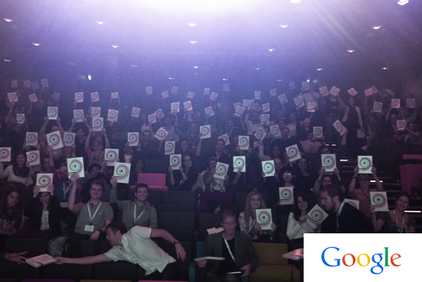
Sharing my work with Google
I just came back from Google Catalyst 2014 in Dublin. The event gathers Google analysts from all over the world. I was thrilled to be invited as external speaker, along with Ajaz Ahmed and Philip Evans. My task was to deliver an inspirational talk on how to design compelling data-stories. The icing on the cake? Everybody received a copy of my book. It was the first time I saw 150 copies of my book altogether. Thank you, Google!
Warning: Undefined variable $img_id in /customers/1/5/9/valentinadefilippo.co.uk/httpd.www/wp-content/themes/ave/templates/vc/vc_single_image.php on line 194
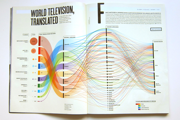
My work for Wired UK
Excited about my first collaboration with Wired. Their September issue features two of my designs: ‘World Television Translated’ and ‘The Stress Nexus’ in the Innovation Untold section. To view them visit my portfolio.
June 2014
Warning: Undefined variable $img_id in /customers/1/5/9/valentinadefilippo.co.uk/httpd.www/wp-content/themes/ave/templates/vc/vc_single_image.php on line 194
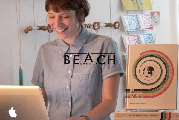
Beach meets…
I have recently met the lovely team at Beach London. As part of their series of interviews “Beach meets”, they have asked me a few questions about my work, my book and what’s next. Here you can read the full interview.
May 2014
And the winner is…
Drum roll please. Ladies and gentlemen, I am excited to announce that I’m the winner for the 2014 Core77 Awards for the Visual Communication category!
Visit the Core77 Awards or read the jury’s feedback.
Want to study Data Visualization?
Data visualization skills are strongly in demand, but where can you study the subject? The Guardian has recently wrote an article about this. As part of it, they featured LCC, the university where I studied and they asked me to share my experience. Here you can read the full article.
Medal at the European Design Awards
YAY! Happy to announce that ‘The Infographic History of the World’ has received another award, a bronze medal in the Infographic category at the European Design Awards.
Talk at Rave Lates
I was delighted to share my work with the graphic design students at Ravensbourne University today. Great bunch of students, awesome building and inspiring evening. Ravensbourne’s blog post about the evening.
April 2014
My talk at Technoport
I was invited at Technoport to talk about the role of visual storytelling in simplifying and communicating complexity. At the three-day event held in Trondheim – Norway’s technology capital – technology and innovation were discussed, celebrated, and implemented. Despite battling a bad cold, I was delighted to share my experience during such a great event. From inspiring talks to innovation workshops and a live experiment in equity crowdfunding, the conference was a big success!
Infographics and dataviz during a theatre performance? It was new to me too, but I was thrilled to collaborate with the Donmar Warehouse Theatre on Privacy, a play by James Graham. I couldn’t have asked for a better project for my theatre debut! I immersed myself into issues of data-privacy bringing the very current topic to life through data visualization projections. Do not miss it if you are in London before the end of May. More about the play here and here.
Information Design Conference
I was delighted to talk at the Information Design Conference. The two-day event, organised by the Information Design Association, brought together information design professionals, researchers, educators, students, and anyone interested in information design. Inspiring talks and stimulating discussions.
Extremely happy to announce that I was awarded a Malofiej for the design work of ‘The Infographic History of the World’. Since 1993, the Malofiej Awards have given recognition to the best infographics published in print and on-line across the globe. I am honoured to receive such a prestigious award. Big thanks to the jury and huge congrats to all the winners!
For the past few months, I have collaborated with Newt Idea, a UX and data driven startup. We produced a detailed service design piece of work for a major British retailer to create a shared internal view of the ideal end-to-end customer experience. My role focused on visualising the findings in visual tools that can be used internally to guide decision making, strategic direction and business prioritisation.
Being a strategic piece with a 10 year scope the project can not be disclosed.
2013
December 2013
Warning: Undefined variable $img_id in /customers/1/5/9/valentinadefilippo.co.uk/httpd.www/wp-content/themes/ave/templates/vc/vc_single_image.php on line 194
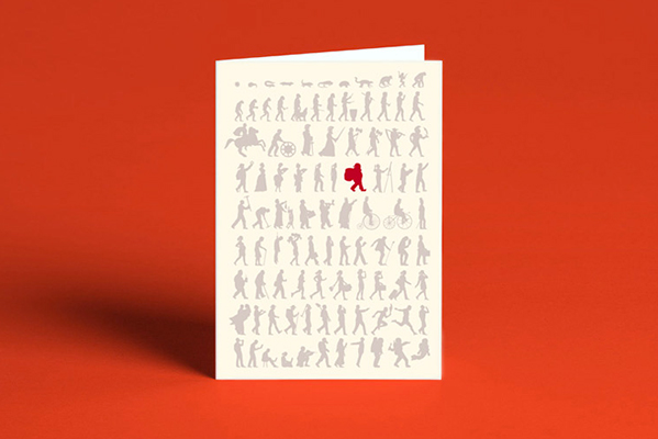
The Christmas cards are finally here!
It’s that time of the year again: Christmas! Well, this year to celebrate my book, I have created a limited edition greeting cards with the mankind silhouettes I designed for the book pagination. The cards are printed on 300gsm matte paper and Spot UV gloss varnishes is applied on the grey silhouettes. Some of these are also available for free when buying a copy of the book in Magma and other bookstores in central London.
November 2013
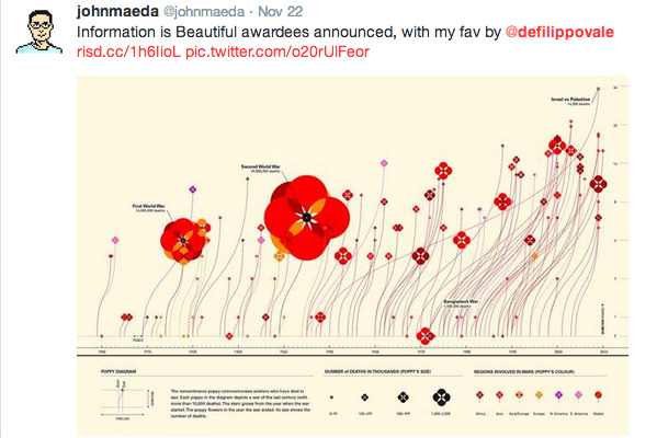
Information is Beautiful Awards
‘Field of Commemoration’ has received a honourable mention at the Kantar Information is Beautiful Awards in the data-visualization category. It’s not exactly a medal, but I feel like a winner – especially after reading this tweet! It’s awesome to be recognised by a jury composed of some of the most radical and famous designers in the world including Jon Maeda!;)
View here the other winning projects.
July 2013
Talk at YCN – A summer of learning
The book is finally out and we have been asked to share our experience with the lovely bunch at YCN during their summer talks. This has been our first attempt to pack the 9-month journey of the making of the book into a less-than-1-hour long presentation. It was a very fun night! thanks everybody who could attend tonight.
June 2013
Who is leading the arms race?
One of the infographics we created for the book ‘The infographic History of the World’ is in The Guardian G2 as a nice double-page dedicated to exploring who has the greatest military might. Read more here